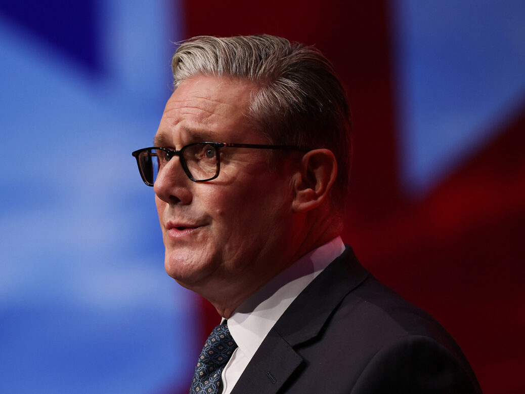
The Labour Party, under the leadership of Keir Starmer, is experiencing a significant setback. This decline is not primarily due to fiscal policies or ideological inconsistencies, but rather a stark issue with its graphic design and branding. As political newcomers like the Reform Party utilize effective visual strategies to capture attention, Labour’s attempts at modern communication appear disjointed and lack coherence.
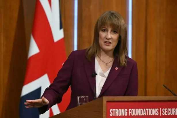
The Reform Party has embraced a bold aesthetic, employing consistent typographic choices that resonate on social media. Their campaign materials feature three signature fonts, with emphasis placed on clear, impactful text. In contrast, Labour’s recent graphic efforts have been criticized for their lack of unity and clarity. For instance, a recent announcement from Rachel Reeves regarding budgetary measures was conveyed through five different graphics, each with varying color schemes that muddled the message. Important points were often lost in complex layouts, such as a statement on fairer taxes that became difficult to read against a pale background.
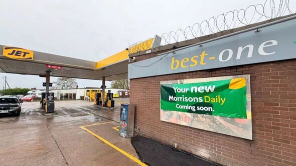
Labour’s struggles with design are not new. During the Caerphilly by-election last year, Labour’s Welsh account shared a rudimentary drawing of a rose with the message, “Our graphic designer is on leave.” Such moments highlight a broader issue within the party’s branding strategy. The official Labour website employs the Poppins typeface, a font criticized for being uninspired and lacking historical significance.
The inconsistency extends to Labour’s social media. Between the start of November and the Budget announcement, the party’s design team changed fonts 17 times, creating a chaotic visual landscape. This lack of cohesion makes it challenging for supporters to identify with the party’s messaging.
Political competitors have effectively harnessed visual language to convey their messages. For example, Zohran Mamdani successfully utilized branding that drew on vintage aesthetics during his campaign for New York City mayor. His materials echoed the hand-drawn styles of Bollywood, establishing a vibrant connection with voters. Similarly, Catherine Connolly in Ireland employed a distinct Celtic design ethos that resonated with her audience.
The Labour Party risks losing its identity as younger voters gravitate towards parties that present a clear and appealing visual narrative. The party’s recent announcements, including a breakfast club partnership with Weetabix, have featured designs reminiscent of vintage children’s books or mid-century travel posters, further diluting its political message.
Labour’s lack of a cohesive aesthetic could have broader implications. As political branding increasingly shapes electoral success, parties with an attractive visual identity tend to gain trust more easily. The current state of Labour’s design should concern its supporters, as it reflects a disconnect that could alienate potential voters.
To address these challenges, Labour may benefit from revisiting historical influences. The arts and crafts movement, particularly the work of William Morris, offers a wealth of design inspiration that could engage a wider audience. Morris’s neo-medieval fonts and designs have remained popular across various demographics, suggesting that a return to these roots could help re-establish the party’s identity.
As the political landscape evolves, Labour must adapt its messaging to resonate with the electorate. By honing its visual branding, the party could create a more compelling narrative that aligns with its core values. As the 2026 elections approach, the need for a clear and engaging story becomes ever more critical. Without a cohesive design strategy, Labour risks becoming less relevant in a rapidly changing political environment.